Latest post

Image
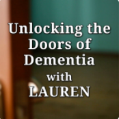
  I want to raise awareness of a superb, Dementia Care podcast that is readily available here or from wherever you go for your podcasts. Created by the exceptional Lauren Mahakian, each podcast explores the spectrum of dementia and dementia care in practical, down-to-earth terms. The content is made very accessible in a way that will educate and support carers, friends and family, whatever their perspective may be. There’s a back-catalogue of thought provoking editions going back to 2019 which shares knowledge and demonstrates what is possible when you have the dedication and courage to think outside the box.

Colour and the psychology of colour. Part 1


‘Back in the day’ as they say, when I was a complete ignoramus where dementia was concerned, I was challenged to design signage that would be effective for people with dementia. Without regurgitating previous content from my grand tally of two posts to date, I did my homework to discover what issues people will typically have when experiencing the cognitive influences of a dementia. From this I created a ‘hit list’ of issues to tackle and designed-in elements to specifically address each of these issues. If it sounds methodical, it was, and it was logical rather than scientific. I needed to know what the issues were more than the science behind them and this was what I felt I needed to effect a succesful design.

To recap, the design features are:


  • Colour
  • Image content
  • Shape
  • Material
  • Text
  • Contrast 
  • Durability
I intend to discuss all these in due course but for this post I’m focusing on the subject of colour and dementia.

So as I was saying, ‘back in the day’ (2007) one of the things I learnt was how dementia can alter perception of colour. Age also affects one's ability to perceive colour effectively as focus and lens quality deteriorate - something which will affect all of us progressively to some degree as we get older. The combination of cognitive impairment and quality of vision is inevitably going to make daily life more difficult to negotiate. Also, as we will all have experienced, when something we take for granted isn’t working properly any more, this leads to frustration too. For example, if you damage a finger or thumb, twist your ankle or get toothache, the everyday activities associated with that part of you will be impaired, making it difficult to pick something up, walk or eat. If you have experienced any of these I hope it was temporary, but it may have made you realise how we take that thing for granted and how difficult it becomes when it's' broken'. This is how I try and think about dementia. How the issue I’m addressing would make me feel, what are the things I’d find difficult, how would I respond and what can be changed to alleviate the problem.

Losing your understanding of colour and the nuances of differentiation is not natural.

“Nature relies on colour as the language of communication.” I’m quite pleased with this statement. It sounds like I know what I’m talking about! You don’t have to be an expert to realise this, it’s just another thing we take for granted and don’t give much thought to in everyday life.

There are people who do think about colour a lot though and one of those particularly noteworthy people is Karen Haller. Her life is all about colour and the psychology of colour. It’s a massive and fascinating subject and I’m broadening my knowledge and understanding through Karen’s online resources. She also has a Facebook group called the Colour Collective which contains some incredible contributions that demonstrate how significant and sophisticated colour is. If you want to learn more about colour I highly recommend looking her up.

So in the context of someone with dementia, recognising what happens to their perception of colour provides a practical level of understanding about why something may prove more difficult in their life, and this is absolutely necessary if we’re going to make changes to alleviate or eliminate specific issues.

When I began educating myself about colour and dementia all the material I saw related to primary colours. One of the origins of this, so I later discovered, was some work by Bob Woods at the University of Bangor in North Wales. He was a contemporary of Tom Kitwood I believe and Bob wrote some papers essentially about colour perception and how the use of colour should be considered. One of my main sources was Stirling University of course, as they were the most prominent authority on such things at the time. But I think their output was probably based on Bob’s. Anyway, the academic emphasis was on use of primary colours to make things in the surroundings easier to see and interpret and this was what I used to create my first designs. As the record shows, they were very effective and embraced by a lot of people. I remember one lady who saw the designs at the launch of the product in 2007. Her immediate utterance on seeing the designs was ‘this is what we’ve been waiting for’. We saw over a thousand people that day but this one stuck in my mind to this day. She was aware of publications which alluded to the use of colour but no-one had yet manifested the talk into products.


The other thing I remember about that day was the controversy. Making signs with colour, words and pictures was surprisingly emotive. Everything from delight to disgust was expressed. Such was the depth of feeling.

The signs became increasingly popular over the next couple of years to the point when we were producing between one and two thousand units per month. The strongest element of their effectiveness was colour and the biggest issue people had with them was….colour! Talk about dividing the judges.

The gripe was that the usage of primary colours was ‘child like’ and therefore demeaning and in certain quarters they became known as the Early Learning Centre signs. I could appreciate this point of view but felt strongly this was off-set by the effectiveness of colours which were used because they really stood out in whatever surroundings they were in, and the sales of the product certainly bore that out.

Why use primary colours?


The use of primary colours was cosistently referred to in the reference materials I was using. The simple reasoning was the level of visibility due to high contract. Simple as you like, but this is where psychology, and my lack of knowledge began to come into play.

There was one aspect of our work that trumped everything else for me and that was it's undeniable effectiveness. I was treated to lots of positive feedback about how the signs had an immediate effect on residents when they were installed. Most notable perhaps was Four Seasons where Caroline Baker was heading up the groups dementia strategy. I’d met Caroline in Belfast and offered to run a free trial at one of their homes. We supplied a batch of bedroom signs and within 18 hours of them being installed Caroline came back to me and wanted to roll them out. This was one of a number of validations for the designs.

But there were people who wouldn’t use the signs because of the use of primary colours. Even though they were available in any colour under the sun if people specified what they wanted. In some cases I'm sure objections were clung onto as an excuse not to part with any money. If this sounds a bit cynical it was also true that no-one I offered a free trial to ever turned it down. All objections evaporated in the face of the 'free' word!

So primary colours were seen by some as inappropriate in their homes because they were demeaning to residents, and for them this over-rode all the potential benefits. That’s a very strong judgement call for the sake of a colour and it niggled me and I didn't find out how to address it properly until some years later.

The most controversial colour was and still is red. Based on output from Stirling Uni’ at the time, this was the colour to use for toilet seats although there wasn’t a red seat available at the time, so I sourced a manufacturer and we promoted these very succesfully alongside the signs. It was a powerful and popular package that was undeniably effective and led to another memorable phone call. I’d just left an event at Aintree Race Course and the car phone went. It was one of my early clients who had taken a couple of red toilet signs and seats. She told me she wanted to order some more goods and how they were blown away by the benefits of the red toilet seat. At the time I understood the benefits were improved visibility that enabled people with cognitive impairments to recognise and use the toilet more confidently and perhaps independently too. Worthy benefits I’m sure you’ll agree. But she told me that wasn’t the most significant benefit, ‘we don’t have any falls in the toilet any more’. It was a good job I'd pulled over to take the call. I was choked and my eyes went a bit leaky. It had never crossed my mind that people would fall over the toilet because they couldn’t see it.  The impact of what she said hit me immediately. Falls in the bathroom had to be particularly dangerous because they are small spaces full of very hard objects. 
This wasn't an uncommon opccurrence in her home and the red seats had stopped this happening.

Red was clearly an effective colour but bloody hell, was it controversial!! 


Stirling changed their minds on the use of red and became a little more vague in their advice. Cumbria Council had hours of debate over whether or not red seats were appropriate, finally concluding they were. But the most noteworthy reaction to red toilet seats specifically was from a short, short haired lady in a suit who made a b-line for me at an event at Stirling Uni’. Being in Scotland I assumed she wanted a fight when she squared up to me in her very short way – please don’t think I’m shortist by the way, I’m only 5’8” myself, but it was memorable. “I’m a one woman campaign against red toilet seats” she stridently announced. It was all I could do not to laugh but she meant it. A lively conversation ensued and I think I won her over. At least to the point where she didn’t want to fight with me any more. 

For all that was an amusing interlude in an otherwise dry event, she was very passionate and animated about nothing other than the use of the colour red.

The issue seemed to be that in certain quarters some people began to rally against the use of red. Even those who had previously advocated it’s use and the argument was that it was a ‘danger’ colour and could be distressing.

This is where nature, psychology and language all roll into one.

Red is widely used by nature to attract attention. Once that attention is ‘grabbed’ there will be some other information to be conveyed, but red is used primarily as an attention grabber. My red underpants never let me down!! 
So this is where the use of language takes over. 'Danger' is an emotive word and it's also incorrect. But I guess this is where the psychology comes in and we associate the colour with something bad. But think about all the things that occur naturally as red and you very quickly have a list of examples where red has nothing to do with danger at all but is there to highlight the presence of something. Red berries for example, the red attracts animals which eat the berries and spread the seeds there by reproducing the plant. Dangerous? hardly. It's much more appropriate to label red an 'alert' colour in this context.

Unfortunately, people who were considered to have an educated voice were calling it a danger colour and purely hypothetical examples were put about along the lines that someone with dementia may think a red toilet seat was covered in blood, or think it was hot. All the hypothesis proposed that red should be avoided. The same people still thought it was ok to paint a toilet door red though! No contradictions there eh?

The one and only negative story I have ever heard about red toilet seats, coincidentally from Caroline Baker again if I recall correctly, concerned a resident who thought the seat was covered in Tomato Soup. I don’t wish to trivialise the individuals plight but it did seem quite amusing and I'm not aware this observation caused any distress.

On the other hand there were shed loads of positives to be had. One of them was a first hand experience when we were doing a short piece for TV about using the seats. We were filming in a care home corridor and placed a red seat in a small toilet cubicle just off the corridor so it could be seen in the back of the shot. As soon as we started filming a resident openly expressed his ‘relief’ shall we say when he spotted the seat and started to whip his pants down on camera. There was no doubt the seat was very effective for this gentleman and thank goodness it wasn’t live!

I hope I’ve demonstrated here that for all that colour can be very effectively employed in a care home, there’s a lot more to it than just the effectiveness. Some people can genuinely become distressed by colour, and others might reject colours because they think they are demeaning to their residents or just look out of place.

In the next part of this post I’ll explain how I came to realise there is a way to please everyone, why there’s still a lot of convincing to do and the wealth of benefits most care homes are missing out on!!

Comments